Monday, May 3, 2010
Rewrite: Calvin and Hobbs
Arabian Nights
Penny-Arcade
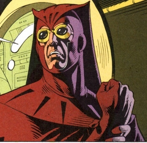
Watchmen
Asterix
Sunday, May 2, 2010
The Arrival
Maus
Fat Freddie's Kat
Monday, March 22, 2010
Tezuka's Buddha Vol 1 Review
Battle Angel Altia Review
Monday, March 15, 2010
Blankets
Calvin and Hobbs
Understaing Comics and McCloud's TED talk too!
McCloud brings up several interesting notions that I, honestly, had never once considered before. I have read many comic books and even several graphic novels in my day, but I had never attempted to analyze comics on a more fundamental level. I had always only paid attention to the drawing skill or the writing skill of the artist/author, but I had never considered the medium before. To think about the art of comics on the level of what it means to abstract something, which I have considered before, but I had never considered it in relation to comics, or even how words relate to that abstraction. Also, the notion of juxtaposition as it relates to comic panels was interesting to dissect, how we, the readers, are given as series of images, and because we notice similarities or can relate these images together, we make the leap that time passes between panels and actions which are crucial to understand the story take place. Which is an aspect unique to comics, as a medium like animation, which is a series of images juxtaposed as well, has the benefit of time being represented by time as 24 frames a second connect actions for the audience (not to say there are not similar juxtaposed understanding that need to be made in animation, but the entire medium is not based around this idea). In addition, McCloud’s thoughts that he shared in his TED discussion, about where he sees comics expanding in the digital age were extraordinarily fascinating. The idea that using the monitor as a window to be able to view a comic as a long sting of images set side by side as opposed to the edge of the canvas forcing us to break that continuous train of thought is a most intriguing and curiously unused harnessing of this technology. When one orders a digital copy of a Marvel Comic, for instance, the comic is represented in the context of a page, just like the tangible equivalent, but this seems silly and short sighted. Another way that I have noticed people have started to utilize digital technology for comics are in the form of motion comics, which real just bridge on the edge of just limited animation and doesn't use any of the elements that McCloud discusses that make comics an unique medium.