Monday, May 3, 2010
Rewrite: Calvin and Hobbs
Reading a great deal of Calvin and Hobbs you begin to notice things, things like how the as an artist like Bill Watterson gets to know his characters, they evolve, visually, until they reach a point of visual refinement that few other cartoonists ever truly achieve. The artistic style of Calvin and Hobbs is deceptive, on a cursorily glance, it seems simple, Calvin’s just a handful of lines, very simply described right? Wrong. In the few lines Bill Watterson uses to construct Calvin, or Hobbs, or any of his characters, he’s able to reveal so very much about each of them. He can show us where the character is holding their weight based on the thickness of the line, the line weight. Bill Watterson’s ability to construct a pose for each of his characters is unrivaled. Each pose struck is so simple, but the weight is always perfect, and the character of the pose is always obvious, instantly readable but almost never stereotypical or cliché, always original and always entertaining. As someone who has tried to emulate Bill Watterson’s style before, it is really really tough. If you choose just about any panel of Calvin and Hobbs and delve into it you’ll find all the layers I listed above and more. Bill Watterson’s drawings look effortless, and I’m sure eventually they were to him to some degree, but each stroke in the frame is painstakingly planned out and is placed perfectly, attempting to draw in Bill Watterson’s style is not a feat that should be take lightly.
Arabian Nights
This 1943 retelling of the classic Arabian Nights tales is a very visually busy and sometimes confused story. The thing that seems to be the most off to me, or perhaps this was intentional, in the sections that are set in the “real world”, aka not in a tale, world seems flat, things in the distance feel like they’re painted on the wall like in a play instead of really being off in the distance. I think on the characters, the varied line weight really helped give the characters an amount of form and detail, even though they seem to be anatomically exaggerated. The main character Schehere’Zadem, for instance, has an overly long neck and body. The use of flat color over the whole piece also seems to flatten the space contained in the frame as well, the thing that seemed to make the characters pop was the use of saturation, less saturation in the background and more saturation in the characters. There isn’t much in the way of shading and the only way the piece seems to show depth is in taking away detail or blacking out a form entirely to make it seem far away.
Penny-Arcade
It started small, a funny little comment poking fun and giving opinions on games with a particular brand of humor. Now Penny-Arcade it a huge force that not only comments on games, but creates games of its own. Penny-Arcade, while usually centering on Tycho and Gabe, two gamers who have defined the protagonists for game humor based webcomics, the strip has added other characters when needed and has even had all sorts of one strip character, usually guys working at some game studio who did something note worthy that week so Penny-Arcade decides that the best way to lampoon the situation will be by portraying people that actually have something to do with the story. Penny-Arcade is very much a topical comic, most of the time their subject matter includes new games, they usually end up either popularizing or creating a shared joke about said game, or gaming industry news. They also frequently “borrow” popular video game characters to put them in comical circumstances, again usually a one shot deal. Reasonably recently they have started doing multi-strip story arcs that sometimes have nothing to do with anything else going on in the comic, they’re just like a random break from the standard formula and I think it really keeps things interesting. These multi-strip stories are usually video game based, or very much video game like in nature. These strips tend to be about some sort of struggle or adventure and are usually very well done, the writing is superb, especially for a web comic.
Watchmen
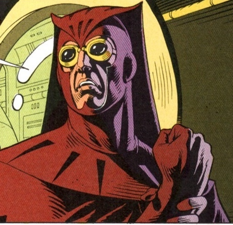
The Watchmen, the seminal work by Alan Moore that helped redefine the superhero in the minds of comic readers everywhere. Moore tried to envision a world where superheroes are real (or rather masked vigilantes), and if that was the case who would take to such a life? The only people who would be drawn to that world would be psychopaths, sociopaths, and the impotent who can only feel powerful if they’re fighting crime. In Moore’s alternate 1985 things are very very then the real 1985, my personal favorite difference is the fact that Richard M. Nixon is a 5th term president, scary thought, technology is more advanced, but the cold war was a frightening as ever. As Moore explored who would be drawn to the world of masked vigilantism in a very realistic light, so too did he explore how the world’s dynamics would change if a real superhero where brought into the world, via Doctor Manhattan. As soon as Dr. Manhattan came into existence, of course, the government snatched him up and used him as a weapon, he ended Vietnam in a week, and he was the single biggest deterrent the United States had against nuclear war. Moore’s world building was so fluid and dynamic I couldn’t help but get sucked into this world of dank back alley crimes, and big international crises. I’m also a big fan of David Gibbon’s artwork throughout the book. His characters have great form and are wildly appealing to look at, and few of them follow the usual big tough body structure that most superheroes do (Night Owl 2 is overweight for Pete’s sake!), Rorschach is one of my all time favorite costumed vigilante ever, what I thought was always really cool was his use of color. While Moore was weaving a narrative that subverted the usual hero archetypes the usual hero colors, the primaries, red, blue, and yellow, were replaced by dominantly secondary and tertiary colors, greens and oranges and purples, and a great deal of brown. These visual choices helped set Watchmen apart from any other super hero comic the moment you read your first page.
Asterix
Asterix is the story of a village of Gauls resisting Roman occupation by drink the magic potion that the village mage creates. Astrix is a fun loving rapscallion who spends his time having fun with the Romans and protecting his village. The drawing style reminds me of a lot of American comedy comics, the characters all drawn with a thick black line, with a thicker outline. It’s very flat and graphic, and the use of color throughout the comic, very flat and mostly very saturated colors, flatness the picture plane of each frame even more. Though the use of blocked out colors, usually a purple, did help create some depth in the frames as making the whole characters or objects that single darker color helped bring them forward in space. Through the technique of flat uses of color in this way, the artist who drew Asterix, Albert Uderzo, was able to achieve depth despite the fact that he was using only flat colors. The characters are appealing and fun cartoon characters, though they do have very stock, one dimensional personalities. Asterix is your typical cartoon protagonist, a trouble maker who always really means well, in this case protecting his village, and his best friend Obelix is the stock dumb strong sidekick.
Sunday, May 2, 2010
The Arrival
Now to start off talking about this comic, it must first be stated that it contains no words what-so-ever. Ok, so, since the pictures have to tell the entire story the drawings a beautiful and refined. The color scheme is monochromatic and the drawings are so detailed and refined that it makes the comic seem like a photo album. The photo album feel is a very interesting contrast to the events this seeming format presents, which are more fantastical and fair tale like then any real life event. It should also be noted that as you go through the piece, signs, labels, and other objects that should have text on them all have a made up language written on them so we couldn’t read it anyway. The photo album feel is easily identifiable and accessible to the reader, while the foreign text found in the format helps give the piece such an odd, other worldly feel. We identify with the characters and we even recognize the world, but when the strange text, the alien creatures, and the very unusual everyday household items are added we suddenly fell out of place in this world. In the end this is a story about human emotion that’s completely accessible to anyone, just like any good fantasy story, if there are characters and an emotional core you can connect with, you’ll accept just about any crazy thing that goes on in the world.
Maus
A groundbreaking graphic novel, the first graphic work recognized as a piece of legitimate literature. It won critical acclaim and even garnish a Pulitzer in its long list of awards. The art style is in black and white with value work accomplished through subtle line work, which blends together to form the values needed. The characters don’t tend to have a thick outline but still have a clear form. The characterizations of different ethnic classes through the use of animals were brilliant throughout this work. Making the Jewish people, the hunted people, mice, while making the Nazis cats, mice’s natural predator, was a very clever, instantly visceral image of the cats rounding up and hunted but cats. Jews of the time were seen as rats, mice, pests by the German people in the 30s and 40s, and they were treated like vermin, just like how we treat mice. The Poles were represented by pigs, but not in a fifthly way, they were more selfish, often truing away and not wanting to have anything to do with the problems of the Jews. The French portrayed as frogs both bring about the stereotype that the French eat frogs and it gave them a sliminess, and grossness, since Art didn’t want to forget the French’s years of Anti-Semitism. The Americans represented by dogs, strong, fast, generally good natured, though often short sighted and easily distracted creatures, wait am I still stalking about dogs or us? There was an interesting scene later on in the novel, after Art and his remaining family get out of the camps, when Art and his father pick up a black hitchhiker, and then part way into the trip, Art’s father leaps into a racist tirade against the poor man, illustrating to Art that even though they went through this experience they still hadn’t learned.
Subscribe to:
Posts (Atom)